
Overview
Fintech focuses on cross-border payments to reimagine SME customer digital channels into a customer-centric intelligent platform to increase the ability to acquire more customers and serve them digitally effectively and delightfully. The new platform is designed with the best UX and UI principles and by applying a design thinking approach to uncover unmet customer needs.
Role
UX/UI Design research, UX writing, UX research, business requirements, and voice of the customer.
Methods
Competitive Analysis, User Research, User journey Flow, User Centric Design Principal, UX writing, Wireframing, Prototype, and Testing.
Old Screens


Brief Market Research
The remittance website caters to Small Medium and Enterprise (SME). My goal in researching the features and functionality of the competitors is to find gaps that MoneyMatch could fill and the issues that they can solve elegantly more than the competitors.
From an overall perspective, some competitors offer much more competitive rates and provide greater features and functionality such as live currency, rate alerts, and forex charts features, multiuser, and multilingual. These functions and features seem essential for a digital provider and may have served to keep customers returning to the platform.
Design Ideation
The design ideation took place based on customer feedback and complaints from the customer service team. The feedback and complaints have been discussed with several departments in the company. Based on these, I have come up with several design principal and ideation. I've started the design ideation with the Dashboard and Transfer.
Background
1. Enhancing the functionality for small-medium enterprise (SME) customers of a digital remittance company by refining the international transfer creation feature.
2. Streamlining the user experience by simplifying the process flow and reducing complexity.
3. Enhancing the quality of UX writing by clarifying and standardizing the copy on the page
Problem Statement and Proposed Changes
1. Lack of features and functions
The website does not have a dashboard where users be able to view the market rates, live currency rates, or announcements for special rate coupons. The users have to rely on the account managers or treasury department for announcements.
The website does not have a dashboard where users be able to view the market rates, live currency rates, or announcements for special rate coupons. The users have to rely on the account managers or treasury department for announcements.
Solution:
Based on user feedback and after doing various case studies, the design will have an operational dashboard with widget styles where multiple pieces of information will be in one place. The dashboard widget feature is as follows:
Widget 1 - Announcement
Widget 2- Rate Alert
Widget 3 - Live Rate
Widget 4 - Alerts
2. Difficulty navigating the platform
Users face challenges in finding and accessing specific features or functionalities within the platform, resulting in frustration and a negative user experience. An example, when users create transactions they did not know that they need to select the currency and amount as highlighted in step 1 in the screenshot above.
Users face challenges in finding and accessing specific features or functionalities within the platform, resulting in frustration and a negative user experience. An example, when users create transactions they did not know that they need to select the currency and amount as highlighted in step 1 in the screenshot above.
Solution:
Provide a tooltip for the customer to select the currency and amount before continuing with the second step.
Provide a tooltip for the customer to select the currency and amount before continuing with the second step.
3. Improvement in UX writing
The copy on the page lacks clarity and consistency. Additionally, there is an issue with inconsistent naming conventions, which has been highlighted by users. For instance, the label "Choose of Favourites" for selecting a previously saved beneficiary creates confusion among users as they associate "Favourites" with chosen beneficiaries rather than all saved beneficiaries.
The copy on the page lacks clarity and consistency. Additionally, there is an issue with inconsistent naming conventions, which has been highlighted by users. For instance, the label "Choose of Favourites" for selecting a previously saved beneficiary creates confusion among users as they associate "Favourites" with chosen beneficiaries rather than all saved beneficiaries.
Solution:
The proposed solution involves renaming labels and UX copy to something simpler and more familiar, allowing users to easily relate to the terminology used.
The proposed solution involves renaming labels and UX copy to something simpler and more familiar, allowing users to easily relate to the terminology used.
Success Metrics
1. Minimize the time required to create orders
Enabling users to effortlessly place orders without having to invest significant time in understanding the page's functionality.
Enabling users to effortlessly place orders without having to invest significant time in understanding the page's functionality.
2. Alleviate the workload of the Business and client support team
Reduce the need for repetitive explanations to users. By implementing a more intuitive design, users will be able to navigate the feature without requiring assistance from the support team.
Reduce the need for repetitive explanations to users. By implementing a more intuitive design, users will be able to navigate the feature without requiring assistance from the support team.
Internal Design Testing
We have distributed the initial design phase and prototype to diverse internal stakeholders from various departments, including interns, business development, support, and front-end developers. This step aims to evaluate the usability of our design and gather feedback from different perspectives within the organization
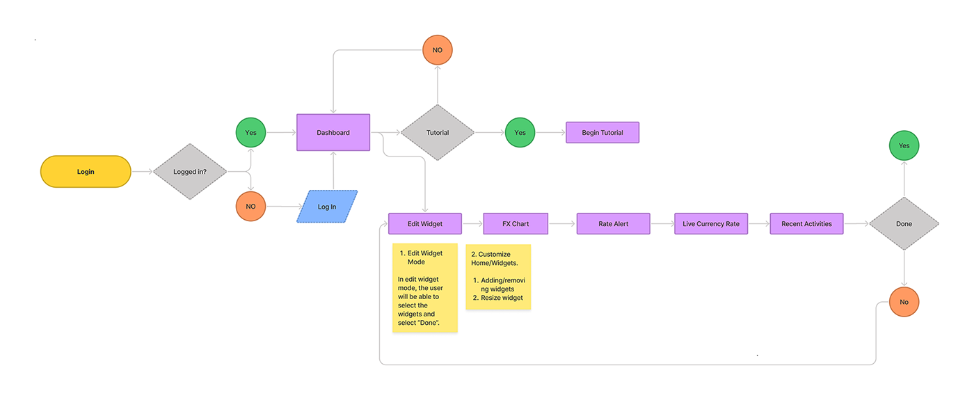
Site Map Task flow
Before beginning with wire-framing there were a few things that needed to establish first. I decided I needed to start with a task flow to get a confident and clear step.


Design Process

Design Prototype - Please view in Computer / Laptop
After completing the initial phase of the project, I progressed to develop the high-fidelity (hi-fi) prototype, encompassing the comprehensive and fully realized design. Below, you can find glimpses of the prototype, you can access the interactive Adobe XD prototype provided below to explore it further.
